Modern web search engines can be traced back to AltaVista, which was originally developed in 1995 by 2 DEC employees, Mike Burrows (google) (recently moved from Powerset to Microsoft) and Louis Monier (now with Cuill).
Historically when you think about web search, you had to think about 4 dimensions:
Historically when you think about web search, you had to think about 4 dimensions:
- Ranking
- Put the best answer in the first few positions
- (As the indexes get bigger and data types keep growing, finding the best answer gets complicated)
- (As the indexes get bigger and data types keep growing, finding the best answer gets complicated)
- Put the best answer in the first few positions
- Comprehensiveness
- The web keeps getting bigger and bigger everyday
- (Can search engine's find, access and index data fast enough?)
- (Can search engine's find, access and index data fast enough?)
- The web keeps getting bigger and bigger everyday
- Freshness
- Just like the weather, web pages change at an alarming fast pace
- (Can search engines update their own indexes fast enough?)
- (Can search engines update their own indexes fast enough?)
- Just like the weather, web pages change at an alarming fast pace
- Presentation
- Make it attractive, quick to scan and support the query process
- (Out of the gate, a search engine needs: spell check, also try, titles and abstracts and highlighting)
- (Out of the gate, a search engine needs: spell check, also try, titles and abstracts and highlighting)
- Make it attractive, quick to scan and support the query process
Google has added a fifth dimension "SPEED"
- When fast page load times are combined with fast page scans, users are able to spend more time focused on the problem and less time waiting on technology.
18 years ago Louis Monier while working at DEC designed today's popular Search Engine Results Pages (SERP's) and times are finally changing. Startups as well as the big 4 are trying to accomplish a lot more with their SERP's. The historical layout appears to be breaking down.
Blended Results pages are coming
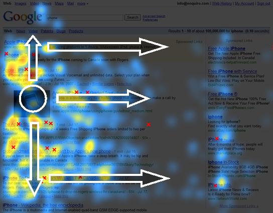
The presentation of blended information is forcing a change and potentially providing opportunity for those willing to take on the 800 lb gorillas. Below is one of gorillia's current attempts at blended SERP.

The loss of the straight line down the left and the inclusion of a single photo dramatically changes the usability of this SERP. When you include a partial second column for ads and a sponsored link section at the top of the page, focus becomes an issue. You can see from the heat map below that we loose the golden triangle and eye movement seems to focus around the photo.
How are startups tackling this problem
SearchMe's beta UI leverages Apple's cover flow concept along with several other UI elements.

Kosmix's alpha UI represents a larger snippet and tons of related links.


Quintura adds a tag cloud UI element to the left of the traditional search results

Viewzi has multiple UI's depending on the type of SERP you think you need.

What to do?
A single query today may yield 100's of videos, 1000's of images and millions of URL's. A new design grid has to be created, one that is organic enough to handle multiple data types, rigid enough to convey a consistent structure and visual enough to work across multiple demographics.
I have attached a wireframe to start the discussion, let me know your thoughts?
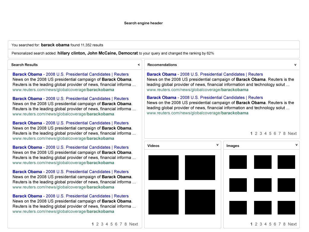
I have attached a wireframe to start the discussion, let me know your thoughts?

The wireframe above supports multiple data types on a single page and forces them into containers based on their data or semantic type. The containers themselves are also dynamic, visible only when appropriate. All containers can be minimized and maximized with a single click.


No comments:
Post a Comment